

The fastest way to increase app adoption is to get every new user to a clear Aha moment within their first session, then use segmented, contextual nudges and measurement to turn that action into habit. That means designing onboarding around one core activation event, surfacing features through carousels, gamification, and well-timed push notifications, and tracking retention cohorts so you know exactly where users drop off. Everything below breaks that approach into steps you can run this quarter.
TL;DR:
- Focusing on reducing time-to-Aha and designing onboarding around a single core activation event significantly increases user habit formation.
- Segmenting users for personalized messaging and timing in-app prompts improves engagement and reduces notification fatigue.
- Tracking retention cohorts on days 1, 7, and 30 reveals where drop-offs happen, guiding targeted improvements.
- Incorporating app features into operational routines, like class check-ins or belt tracking, boosts habitual use more effectively than discounts alone.
- Leading with leadership endorsement and staff training enhances adoption, as user enthusiasm depends heavily on staff engagement and organizational buy-in.
Table of Contents
- What Are the Highest-Impact Ways to Increase App Adoption?
- How Do You Design Onboarding to Hit the Aha Moment Fast?
- How Do You Get Users to Discover Features Without Annoying Them?
- What Metrics Actually Tell You What to Fix?
- Which Promotion Channels Actually Improve Adoption Quality?
- How Should You Segment Users to Personalize Adoption?
- What Mistakes Kill App Adoption, and How Do You Fix Them?
- How Does This Playbook Apply to Studio and Membership Apps?
- Why Adoption Is a Leadership Problem, Not Just a Product One
- Get Your Studio’s App Adoption Moving with DojoTrack
- Sources
- FAQ
What Are the Highest-Impact Ways to Increase App Adoption?
Not every tactic deserves equal attention. Some produce results within weeks; others take longer but compound over time. Here’s a working checklist to prioritize your effort, with the KPI that tells you whether each one is actually paying off.
- Redesign onboarding around one Aha moment. Rationale: users who reach perceived value fast convert to habitual use. KPI: time-to-Aha (minutes from install to first core action).
- Segment users before you message them. Rationale: tailored onboarding and communication reduce notification fatigue. KPI: opt-in rate by segment.
- Use behavioral triggers instead of fixed schedules for in-app help. Rationale: contextual nudges outperform generic tours. KPI: feature adoption rate.
- Gamify milestones tied to real progress. Rationale: visible progress increases session frequency. KPI: sessions per active user, weekly.
- Time push notifications around demonstrated value. Rationale: value-first messages reduce opt-out rates. KPI: push opt-in and unsubscribe rate.
- Localize and optimize your store listing. Rationale: better ASO improves install-to-open quality. KPI: install-to-first-session conversion.
- Run pilot programs with clear success metrics. Rationale: structured pilots convert to full rollouts faster. KPI: pilot-to-paid conversion.
- Instrument retention cohorts from day one. Rationale: you cannot fix what you cannot see. KPI: day 1/day 7/day 30 retention.
- Collect feedback at key moments, not just at exit. Rationale: in-context surveys catch friction before churn. KPI: survey response rate and resulting fix velocity.
Onboarding redesign and cohort instrumentation are the two you should start with this week. Gamification, localization, and pilot structuring pay off over a longer horizon but matter just as much once the basics are in place.
How Do You Design Onboarding to Hit the Aha Moment Fast?
Most onboarding fails for one reason: it tries to explain the whole app before the user has done anything meaningful. Best-practice onboarding guides users to a single meaningful action fast rather than walking them through every screen. Here’s how to build that flow.
- Name the Aha moment per persona. A new gym member’s Aha might be seeing their next class on the schedule; a studio owner’s might be checking in a student in under ten seconds.
- Ship a minimum flow and test it with real users. Use TestFlight or an internal build with five to ten actual users before a wide release; watch where they hesitate.
- Apply progressive disclosure. Show only what’s needed for the first action, then reveal advanced features once the user is engaged.
- Request permissions in context, not upfront. Ask for notification access right after the user schedules something, not on the welcome screen.
- Instrument the funnel. Track time-to-Aha, conversion rate into the core action, and day-1/day-7 retention from the first release.
This mirrors what the Technology Acceptance Model has shown for decades: perceived usefulness and ease of use predict whether someone keeps using a tool at all.
Pro Tip: Cut your onboarding flow in half, then cut it again. If a step doesn’t directly lead to the Aha action, move it to later or delete it.
How Do You Get Users to Discover Features Without Annoying Them?
Feature discovery fails when it’s either invisible or intrusive. The fix is matching the format to the moment and the message to demonstrated behavior, not a fixed calendar.
- Use carousels for passive discovery when a user has time to browse, like right after completing a task with nothing urgent next.
- Use slideouts for active nudges triggered by behavior, such as a user hovering over a locked feature or abandoning a flow halfway.
- Build gamified sequences around real milestones, not arbitrary points. A belt progress bar tied to actual attendance means more than a generic “level up” badge.
- Send push notifications only when they carry value. “You’re 2 classes from your next stripe” beats “Come back to the app!”
- Time permission prompts to the moment of relevance. Asking for notification access right when a user sets a reminder gets far higher opt-in than asking on first launch.
None of this works if it’s constant. A slideout every session becomes noise fast, and a badge for something the user didn’t earn feels hollow. The goal is fewer touches that land harder.
What Metrics Actually Tell You What to Fix?
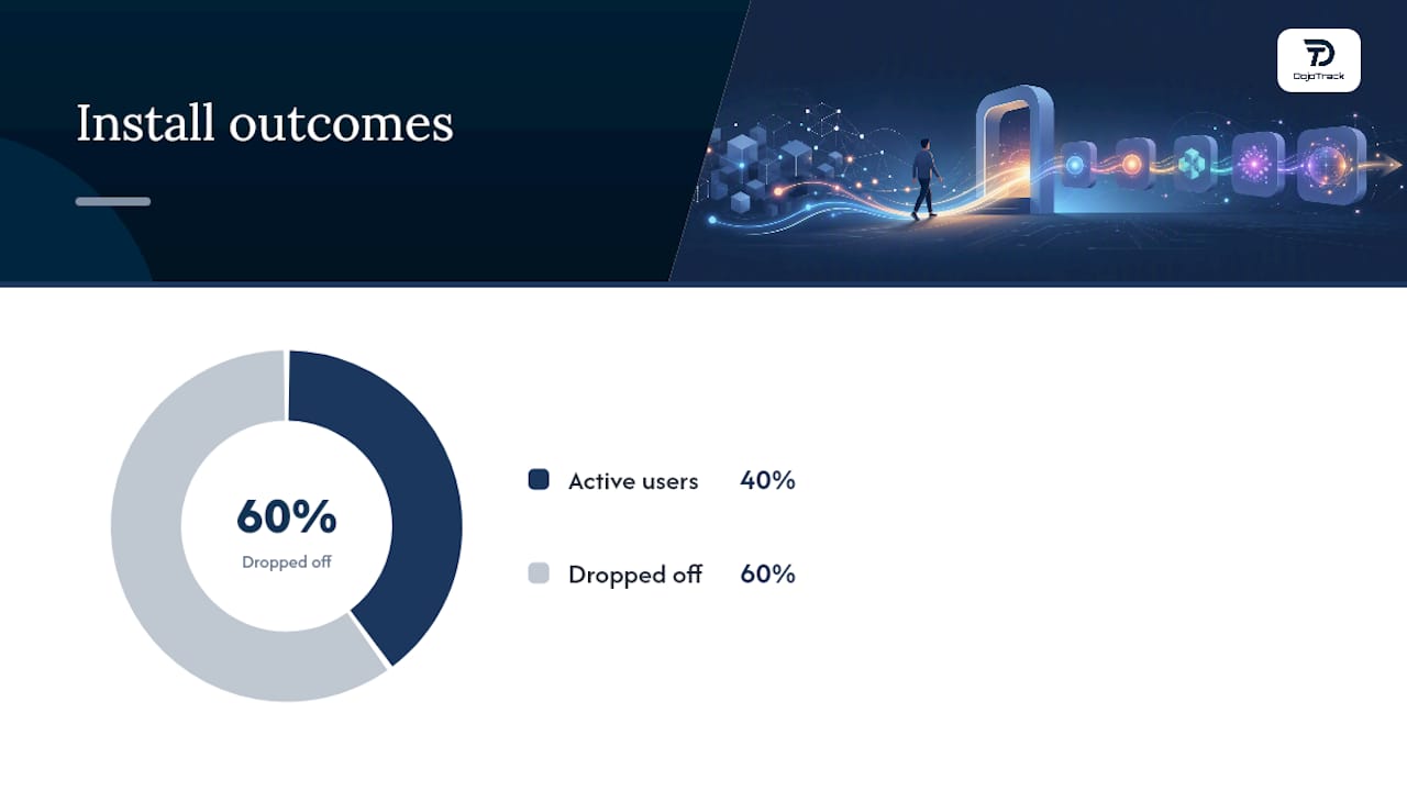
You can’t improve what you don’t measure, and adoption problems hide in aggregate numbers. A 40% install-to-active rate tells you nothing about why the other 60% dropped off. You need cohorts, not averages.
Track these at minimum:
- DAU/MAU ratio to gauge how sticky the app is relative to its total user base.
- Retention cohorts by day 1, day 7, and day 30, since industry data shows retention drops steeply in the days right after install.
- Feature adoption rate for each major feature, to see which ones actually get used after discovery.
- Time-to-Aha, the median minutes or sessions between install and the first core action.
By the Numbers: Mobile apps typically lose a large share of new users within the first week of installation, which is exactly why day-1 and day-7 cohort tracking matters more than lifetime averages.
Once you have funnels built, run short in-app surveys at specific drop-off points, right after a user abandons a flow, for instance, rather than a generic exit survey. Quantitative cohorts tell you where the leak is; a two-question survey at that exact moment tells you why.
Which Promotion Channels Actually Improve Adoption Quality?
Driving installs is easy. Driving installs that convert into active users is the real challenge, and it starts before the download button gets tapped.
- Optimize your store listing with localized screenshots and copy so the app’s value is obvious before install, not after.
- Use pre-event or pre-launch teasers that set expectations, then reinforce with on-site prompts (QR codes at the front desk, a staff-led “let’s set this up now” moment).
- Make certain features mandatory rather than optional during rollout. Requiring check-in through the app, for example, forces the habit loop instead of hoping users find it.
- Run structured pilots with clear success metrics for B2B or multi-location rollouts. Effective pilots include dedicated onboarding support and weekly check-ins, not just a login and a hope.
- Design incentives around activation, not just installs. A discount for completing your first in-app class booking beats a discount for simply downloading the app.
A studio evaluating web presence as part of a broader launch push can also look at gym-focused web design to make sure the pre-download experience matches what the app delivers.
How Should You Segment Users to Personalize Adoption?
Blasting every user with the same message is the single fastest way to burn out your notification budget. Segmentation lets you match the message to where someone actually is.
- New users need onboarding aimed squarely at the Aha moment, nothing else.
- Inactive returning users need a single reason to come back, not a full feature recap.
- Power users are ready for advanced features and referral asks, not beginner tips.
- Trial users in B2B contexts need ROI-focused messaging tied to what they’re evaluating.
- Instructors or staff need role-specific tours built around daily operational tasks, not consumer-style walkthroughs.
Segmented communication reduces notification fatigue because each message actually applies to the person receiving it, which is also why permission opt-in rates climb once messaging feels relevant instead of generic.
What Mistakes Kill App Adoption, and How Do You Fix Them?
Most adoption failures trace back to the same handful of mistakes, and most of them are cheap to fix.
- Overlong onboarding. Fix: cut every step that isn’t the Aha action.
- Permission spamming on first launch. Fix: ask in context, tied to a specific action.
- Feature bloat in the first-run experience. Fix: hide anything not needed for activation.
- No measurement in place before launch. Fix: instrument funnels before you ship, not after.
- Waiting for a “perfect” feature set. Fix: release a core functional set and iterate from live feedback instead of delaying launch.
Pro Tip: If you can only fix one thing this week, fix permission timing. Moving a single prompt from launch to the moment of relevance often lifts opt-in rates without touching a line of onboarding copy.
How Does This Playbook Apply to Studio and Membership Apps?
For a martial arts school, the Aha moment is concrete: a student books tomorrow’s class in ten seconds, or a parent checks their child’s belt progress without calling the front desk. That immediacy is what turns a download into daily use.
Making the app part of mandatory operational workflows, like attendance check-in or belt promotion tracking, converts utility into habit far more reliably than a discount ever will. Instructor-led adoption matters just as much: when staff walk new students through the DojoTrack student app at sign-up instead of leaving it optional, usage rates climb immediately.
A rollout checklist that works across studio sizes:
- Days 1 to 30: Require check-in through the app; train staff to walk every new member through belt progress viewing.
- Days 31 to 60: Layer in push reminders for upcoming classes and milestone notifications.
- Days 61 to 90: Review attendance and retention data to spot which cohorts adopted fastest, then adjust staff scripts accordingly.
Why Adoption Is a Leadership Problem, Not Just a Product One
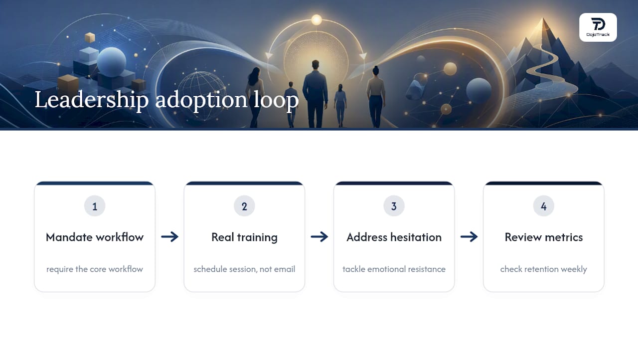
The best onboarding flow in the world fails if front-desk staff shrug when a student asks about the app. Leadership endorsement and real staff training move adoption numbers more than any UI tweak. Emotional resistance to new tools shapes adoption outcomes just as much as usability does, which means training has to address hesitation, not just mechanics.
Managers should mandate the core workflow, schedule a real training session instead of a one-line email, and check the retention metrics weekly, not quarterly.
Get Your Studio’s App Adoption Moving with DojoTrack
DojoTrack is built around the same principle this entire playbook rests on: adoption happens when the app is woven into daily operations, not bolted on as an extra. The student mobile app lets members check belt progress, view schedules, and get push notifications the moment there’s something worth knowing, while AI-driven retention signals flag students drifting toward inactivity before they quit. Automated reminders handle the follow-up so your staff isn’t chasing down no-shows manually.
You can start with DojoTrack’s free core tier and unlock automation and app features as your school grows. If you’re ready to see how it fits your studio, explore DojoTrack and get your rollout checklist moving this month.
Sources
- App retention is hard — here’s how to improve it | Appcues
- Technology Acceptance Model (TAM) | Newcastle Open Research
FAQ
What Is the Fastest Way to Increase App Adoption?
Redesign onboarding so every new user reaches one clear Aha moment in their first session, then reinforce it with segmented pushes and contextual feature discovery.
What’s a Good Retention Benchmark for a New App?
There’s no universal number, but tracking day 1, day 7, and day 30 cohorts matters more than any single benchmark since most apps see steep drop-off in the days right after install.
How Do You Reduce Notification Fatigue?
Segment users first, then send messages tied to demonstrated behavior instead of a fixed schedule, since tailored communication measurably reduces opt-outs.
Do Martial Arts Studios Need a Dedicated App to Improve Retention?
A dedicated app that ties into daily operations, like class check-in and belt progress tracking through a platform such as DojoTrack, tends to drive habitual use more reliably than a generic scheduling tool.
What’s the Biggest Onboarding Mistake Teams Make?
Trying to showcase every feature before the user has completed one meaningful action, which delays the Aha moment and increases early drop-off.