
Analytics Dashboard Design: 3–5 Metrics, Templates for Studios

A good analytics dashboard answers exactly one decision and surfaces 3 to 5 hero metrics in a clear visual hierarchy. It follows the 5-metrics rule, sizes its primary KPI far larger than anything else on the screen, and gets checked against real, messy data before anyone calls it done. Some studio dashboards are designed following this exact logic, aiming to allow owners to glance at them once and know what to do next.
TL;DR:
- The primary KPI on a dashboard must be at least three times larger than supporting metrics to capture immediate attention during the first few seconds.
- Limiting a dashboard to five or fewer hero metrics ensures clarity and prevents overwhelming users with information unrelated to the main decision.
- Supporting charts should be grouped clearly and arranged structurally according to the user’s role, such as executive, operational, or analytical, to prevent density disjoint.
- Chart choices should prioritize perceptual accuracy, with line charts for trends and bar charts for comparison, avoiding misleading visual encodings like pie charts or 3D graphs.
- Regular maintenance, including testing edge cases and tracking adoption metrics, is essential to keep dashboards relevant, avoid redundancy, and build user trust.
Table of Contents
- What Makes Analytics Dashboard Design Effective?
- How Should You Lay Out Dashboard Components?
- Which Chart Type Fits Your Data?
- What Are the Color and Typography Rules for Dashboards?
- How Do You Design for Mobile and Accessibility?
- Where Can You Find Dashboard Templates and Inspiration?
- What Belongs in a Dashboard Design Checklist?
- How Do These Rules Apply to a Martial Arts Studio Dashboard?
- What Maintenance Habits Keep Dashboards Useful?
- DojoTrack: A Purpose-Built Option for Studio Dashboards
- Sources
- FAQ
What Makes Analytics Dashboard Design Effective?
Most dashboards fail for the same reason: they try to answer five questions at once and end up answering none of them well. Effective analytics dashboard design starts with a single operational question, written as a sentence, not a vague title like “Sales Overview.” A better title reads “Which accounts are at risk of churning this quarter?” That framing forces every tile on the screen to serve one decision instead of competing for attention.
The 5-metrics rule backs this up: cap primary tiles at a small number, typically around five or fewer. If a stakeholder asks for a sixth headline metric, that’s usually a sign they need a separate dashboard, not a bigger one.
Visual hierarchy matters just as much as metric count. Eye-tracking research on business intelligence tools found that users spend roughly 60% of their first 8 seconds looking at the largest tile on screen, which means your primary KPI needs to be at least three times larger than any supporting element, or it simply won’t register first.
What separates a dashboard people actually use from one that gets ignored after week one:
- One decision sentence as the title, not a generic label
- 3 to 5 primary metrics, ranked by importance to that decision
- Primary tile sized notably larger than secondary tiles
- A one-line annotation on each hero metric explaining what changed and why
- Adoption tracked through unique viewers, time on dashboard, and repeat viewer rate, with a deprecation cadence for anything nobody opens
Pro Tip: A one-line annotation per primary tile, stating what changed and why, often drives more immediate action than any extra chart you could add. That single sentence does more work than a second visualization ever will.
How Should You Lay Out Dashboard Components?
Layout is where good intentions collapse under real data. Start with a 12-column grid, the same structural backbone most modern design systems use, and place your KPI strip in the top-left corner, where F-pattern scanning behavior means eyes land first.
A practical build order looks like this:
- Place a few scorecards in a top-left KPI strip sized to dominate the F-pattern’s first scan.
- Group supporting charts below or to the right, using negative space instead of borders to separate clusters.
- Cap each visual grouping at a moderate number of elements to avoid overwhelming the viewer.
- Choose one of three structural patterns based on the user’s job: executive (headline trends, minimal drill-down), operational (real-time status, action-oriented), or analytical (dense, filterable, built for exploration).
- Hand engineering explicit specs before build: minimum touch targets, skeleton loading states, and edge-case handling for nine-digit numbers or missing fields.
Practitioners increasingly argue that matching the dashboard pattern to the user’s actual job prevents what one UX strategy piece calls “density disjoint,” where an executive gets an analyst’s dense filter panel and an analyst gets an executive’s oversimplified summary. Neither one can do their job with the other’s screen.
Which Chart Type Fits Your Data?
Chart selection isn’t a style choice. It’s a perceptual accuracy problem. Position and length are the most accurately judged visual encodings; area and angle are the least accurate, which is exactly why pie charts and 3D graphs routinely mislead viewers on magnitude.
Match the chart to the shape of the data:
- Trend over time: a line chart, always, never a bar chart pretending to show trajectory
- Category comparison: a horizontal or vertical bar chart, sorted by value
- Composition or parts-of-a-whole: a stacked bar chart for two or three segments, or a plain table once you exceed four
- High-density, many-row data: a table with embedded sparklines, not a cluttered multi-line chart
- Small but meaningful shifts: annotations placed directly next to the chart, not buried in a tooltip
Pro Tip: If you find yourself explaining a chart verbally in a meeting, the chart has failed. Swap it for a table or add a one-line annotation instead. A step-by-step dashboard design guide frames this same principle as choosing charts by data shape first, decoration second.
What Are the Color and Typography Rules for Dashboards?
Color discipline is one of the fastest ways to separate a professional dashboard from an amateur one. Use one accent color for your brand and primary metric, gray for every supporting element, and reserve red and green exclusively for variance against a target, never for decoration.
A few non-negotiables worth locking into your design system:
- Never use a rainbow palette for categorical data. It forces viewers to memorize a color key instead of reading the chart.
- For multi-series line charts, differentiate with line style (solid vs. dashed) or explicit labeling before reaching for more colors.
- Replace borders and boxes with whitespace and a clear typographic scale. Weight and spacing separate sections more cleanly than a ruled line ever does.
- Check contrast ratios against WCAG guidelines so status colors remain legible for colorblind users, not just the designer who picked them.
This color functionality guidance exists because misapplied color is the single fastest way to make a viewer misread status at a glance.
How Do You Design for Mobile and Accessibility?
A dashboard that only works on a 27-inch monitor isn’t finished. Mobile users need the same one decision, just delivered through progressive disclosure: top KPIs first, supporting detail behind a tap.
Build these constraints in from the start, not as a retrofit:
- Arrange KPI tiles vertically on mobile with the primary metric prominently at the top
- Touch targets sized to meet recommended accessibility guidelines for mobile interfaces
- Type sizes readable without zooming, even for dense analytical tables
- Skeleton loaders for slow queries instead of a blank screen, plus clear empty-state messaging when a filter returns nothing
- Error boundaries that explain what broke, not a silent failure or a raw stack trace
None of this is optional once real users with real devices start opening the dashboard on a phone between classes or on a factory floor.
Where Can You Find Dashboard Templates and Inspiration?
Visual inspiration and production-ready code solve different problems, and conflating them is how teams ship dashboards that look great in a mockup and break the moment real numbers arrive.
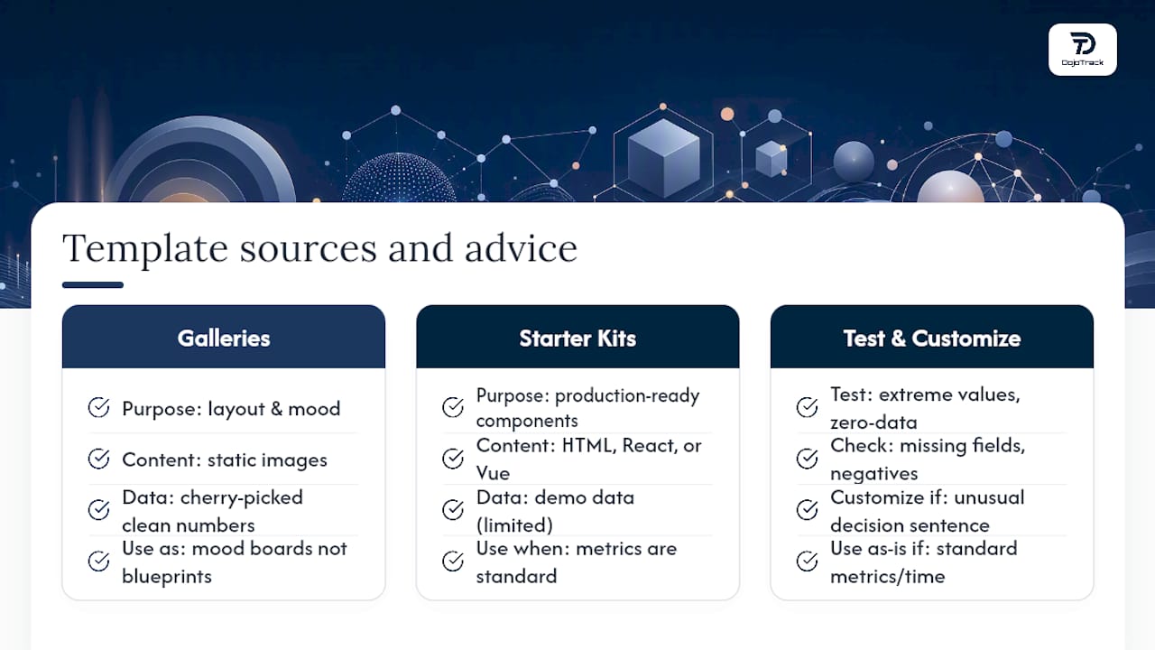
Galleries like Dribbble and Pinterest are useful for layout ideas, spacing rhythm, and color pairing, but they’re static images with cherry-picked, clean numbers. Treat them as mood boards, not blueprints. Starter kits are a better next step for actual builds. Template roundups covering kits like TailAdmin give you real HTML, React, or Vue components you can wire to live data, but the same source warns to test every template against production data before shipping, since demo data rarely includes negative numbers, nine-digit totals, or blank fields.
Before adopting any template, run it through extreme values, zero-data states, and missing fields. Testing templates against edge cases during prototyping catches the regressions that only show up once real customers start generating real data.
Customize when your decision sentence is unusual or your data has unique edge cases. Use a template as-is when your metrics are standard (revenue, retention, attendance) and time matters more than novelty.
What Belongs in a Dashboard Design Checklist?
A one-page spec before you open a design tool saves weeks of rework later. Write these fields down before building anything:
- The decision sentence: the exact question this dashboard answers
- The audience: who opens it and what job they’re doing when they do
- 3 to 5 ranked primary metrics, with the single most important one identified
- Refresh cadence: real-time, hourly, daily, or weekly
- A named owner responsible for the dashboard’s accuracy and relevance
- Sunset criteria: the conditions under which this dashboard gets retired
Prototype against edge cases before launch: nine-digit numbers, negative percentages, and blank fields all need defined behavior, not a crash. After rollout, track adoption honestly.
| Checklist item | What to measure |
|---|---|
| Adoption | Unique viewers per week |
| Engagement | Average time on dashboard |
| Retention | Repeat viewer rate |
| Health | Deprecation trigger if unopened for 30+ days |
This pre-build spec approach reduces scope creep during design and gives you clean criteria for killing a dashboard later, which matters just as much as building one well.
How Do These Rules Apply to a Martial Arts Studio Dashboard?
A studio owner’s version of the decision sentence might read: “Which students need outreach to prevent dropout this month?” That single question shapes everything else on the screen.
Hero metrics for a studio dashboard, ranked by relevance to that decision:
- Attendance rate, since missed classes are the earliest churn signal
- Retention velocity, tracking how fast students are dropping off compared to last month
- Active families, since family accounts churn differently than individual students
- Average revenue per user (ARPU), tying retention directly to studio income
Annotations turn these numbers into action. Attendance data tied directly to retention outreach is exactly the kind of drill-down that moves a dashboard from passive reporting to a daily dojo dashboard instructors actually check between classes.
What Maintenance Habits Keep Dashboards Useful?
Most dashboard failures aren’t design failures. They’re maintenance failures. Nobody schedules a quarterly sweep, so dashboards multiply until three of them technically answer the same question with slightly different numbers, and trust erodes.
Run regular sweeps and kill dashboards nobody opens. Require a one-line diagnosis on every primary tile, not just a chart. Assign a named owner to every dashboard, and track adoption metrics with enough discipline to actually act on a bad number. Building fewer, sharper dashboards beats building more of them.
— DojoTrack
DojoTrack: A Purpose-Built Option for Studio Dashboards
If you’re a studio owner rather than a designer building dashboards from scratch, there’s a faster path than assembling a custom analytics stack. Some platforms for martial arts schools offer built-in features such as attendance rate, retention risk scoring, active family counts, and revenue metrics, designed around the decisions studio owners make each week, rather than generic business KPIs retrofitted to fit.
Some platforms offer core features including student and membership management, attendance tracking, and scheduling at no cost to start, allowing users to see the dashboard approach in action before committing to paid automation and retention tools. For deeper KPI examples, see how membership tracking connects directly to retention outcomes.
If you’d rather review real studio analytics than design your own from a blank canvas, check out DojoTrack and see what a decision-driven dojo dashboard looks like when it’s built for your business specifically.
Sources
For deeper technique, read the decision-driven dashboard playbook, the UX approach to data visualization, the dashboard UI pattern guide, and coaching resources for service-based businesses applying similar metrics thinking.
- Dashboard Design That Drives Decisions, Not Vanity
- Rethinking data visualisation: UX approach to dashboards
- Dashboard UI Design: Patterns and Best Practices
- How to Design a Dashboard UI: A Step-by-Step Guide (2026) – AIDesigner Blog
FAQ
How Do You Design an Analytics Dashboard?
Start by writing the exact decision the dashboard answers, then pick 3 to 5 hero metrics ranked by importance, size the primary KPI at least three times larger than supporting tiles, and test the layout against real, messy data before launch.
What Is an Analytics Dashboard?
An analytics dashboard is a visual interface that surfaces key metrics in real time or on a set refresh cadence, built to answer one specific operational question rather than display every available data point.
What Is the 5-Second Rule for Dashboards?
It refers to the finding that viewers spend most of their first few seconds of attention on the largest visual element on screen, which is why the primary KPI tile needs to dominate the layout, not compete equally with secondary charts.
Can ChatGPT Create Dashboards?
ChatGPT and similar tools can generate starter code, chart configurations, or layout suggestions for a dashboard, but the decision sentence, metric selection, and edge-case testing still require human judgment grounded in the actual business question. Platforms like DojoTrack apply that judgment specifically to martial arts studio operations rather than generic templates.
Where Can I Find Free Dashboard Templates?
Gallery sites like Dribbble offer visual inspiration, while starter kits such as TailAdmin provide editable HTML and React components, though every template should be tested against real production data, including zero values and missing fields, before it goes live.